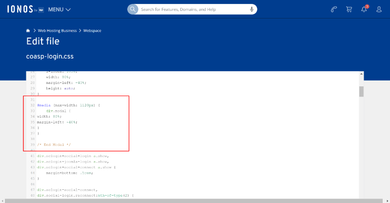
Looking at the SCLogin default css, there's a fixed width on the div.modal element. The width is set to 560px with a margin left of -280px. In the browser dev tools, I changed the following and it seemed to size it properly when I previewed it on a mobile size.
div.modal {
width: 80%;
margin-left: -40%;
}
You'll want to target a specific screen size like
@media (max-width: 1120px) {
// CSS from above
}
[Edited to Add]
Actually, looking at our default.css file around line 36, there's a line already like this but max-width is 576px. Try changing it to 1120px instead and see if that works.
I'll put an issue in our tracker to test this fix for the default theme, but try changing that value in your theme to test now.
-Melissa
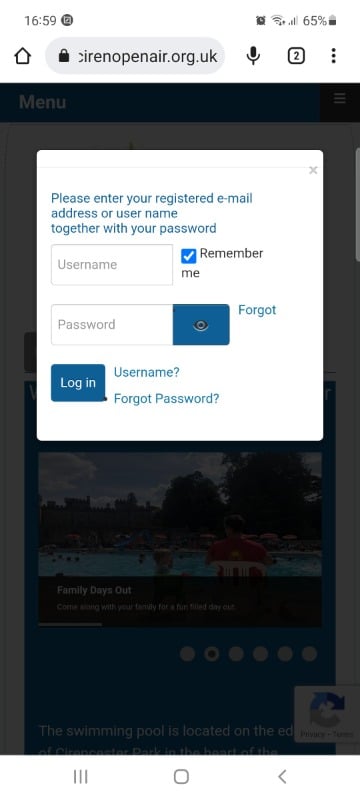
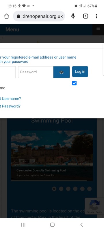
 Login Modal Popup on Mobile devices in Portrait mode - does not fit on screen
