Topic-icon Change colors of Register button

Active Subscriptions:

None
3 years 1 month ago - 3 years 1 month ago #67128 by rklepp77
The non-hover state color of the modal Register button is a dark grey/black with white text.  Hover over state switches that to a lighter grey.  The black/white text is a bit difficult to see, so I would like to modify that button fill color to something else, which also may require me to change the text color.

Where and how would I achieve that goal?

I also understand that any modifications to the code may require re-doing if an update is applied, but I would like the guidance to do it now, then repeat it if necessary, later.

Attached below is the button to which I'm referencing.

Thanks.

   
Attachments:
Last edit: 3 years 1 month ago by rklepp77.
The topic has been locked.
Support Specialist
3 years 1 month ago #67131 by mel
It looks like you're using the sourcecoast theme for SCLogin. In the sourcecoast.css theme file around line 127, change
.sclogin-modal-links a.btn-primary {
    color: #FFFFFF;
}
to
.sclogin-modal-links a.btn-primary, .sclogin-modal-links a.btn-secondary {
    color: #FFFFFF;
}

I am going to check in that change in for the sourcecoast theme and it will be included in the next release. It makes sense and is something that was probably overlooked.

To keep your changes from being overwritten, I'd suggest making your own theme for SCLogin. It's basically copying that css file and renaming it, then setting the theme parameter in SCLogin. The full steps can be found here .

Hope this helps, but let us know if you have any other questions.

-Melissa
The following user(s) said Thank You: rklepp77
The topic has been locked.
Active Subscriptions:

None
3 years 1 month ago - 3 years 1 month ago #67134 by rklepp77
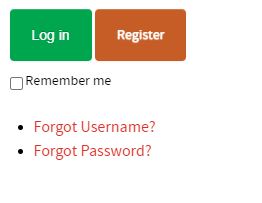
Thank you for your reply.  Your post prompted me to review the sourcecoast.css theme file, create a customized theme file, then modify it to produce what I was looking for, which was modifying the look of the Register button - from the black non-hover, grey hover to what I picture below.

Here is how I achieved it, for anyone else wondering.

1. Added the following lines at the bottom of my custom theme file:


.sourcecoast .btn-secondary{background-color:#c65d26}

.sourcecoast .btn-secondary:hover{background-color:rgba(250,174,93,0.8 )}

 The colors can be whatever you want them to be.  The first line defines the non-hover color scheme.  The second is the hover color scheme, which is also made opaque by whatever percentage you desire.  In the above example, I set mine to 80% (0.8 ).  You will also have to supply hex color code for the first line, then RGB color code for the second.  You could choose the same color for both and just use the opacity to lighten it or choose different colors.  Here is a nice color picker site for reference: htmlcolorcodes.com/


To modify the text color for this secondary button, look around line 76....  modify the color from the default black of 000000 to whatever you want.  I chose white.

#form-sclogin-submitcreate a,
.scuser-menu a.dropdown-toggle {
    color: #FFFFFF;
}


Attachments:
Last edit: 3 years 1 month ago by rklepp77.
The topic has been locked.
Support Specialist
3 years 4 weeks ago #67135 by mel
I'm glad you were able to get something going which matches the theme of your site.

Thank you for the tutorial for others. It was very detailed and helpful for anyone else who may want to do the same changes and may not be as knowledgable with CSS. :)
The following user(s) said Thank You: rklepp77
The topic has been locked.